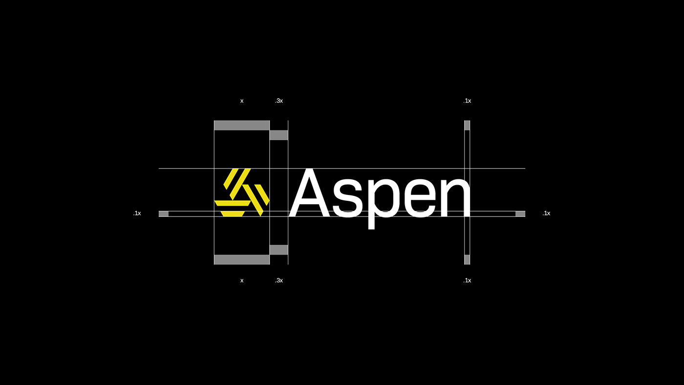
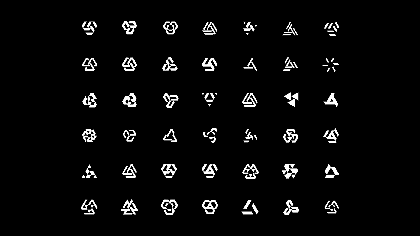
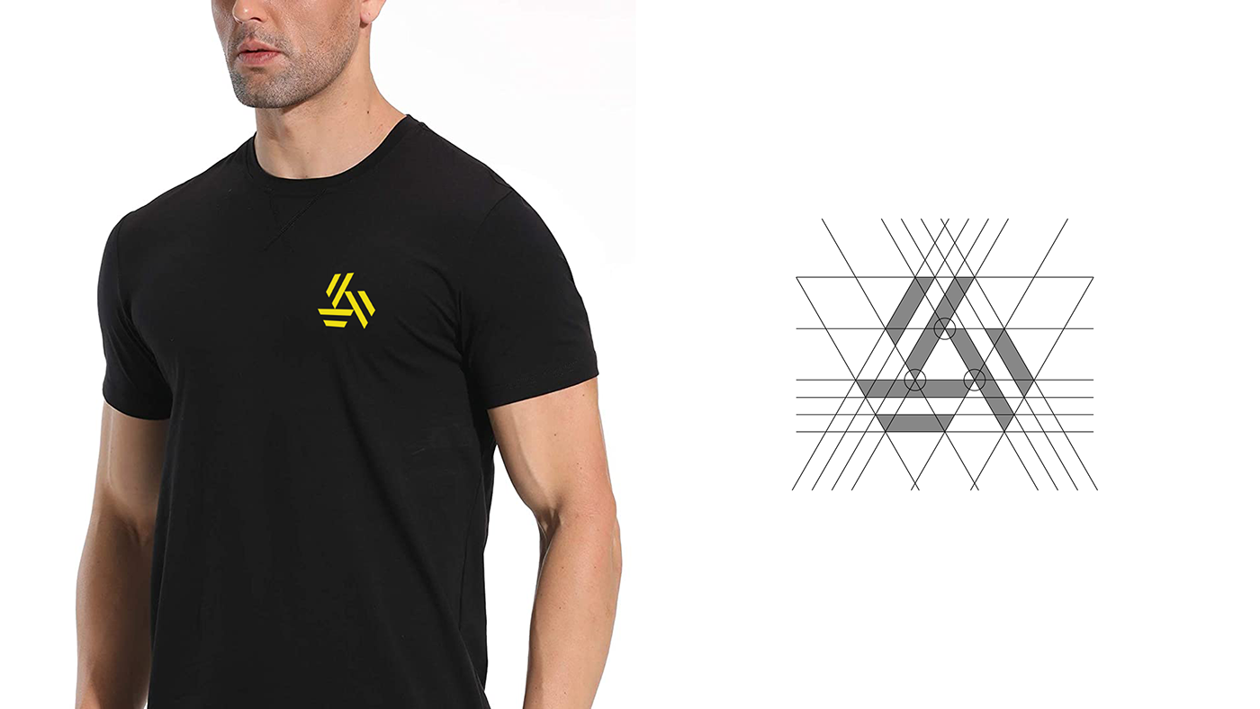
Aspen
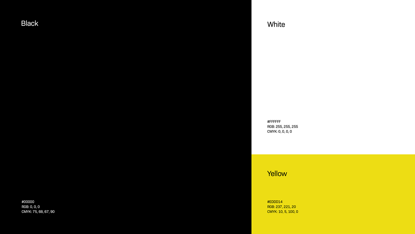
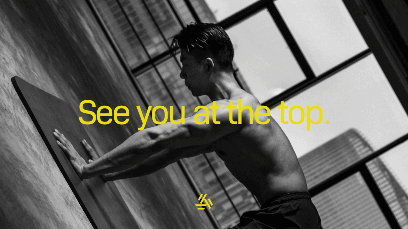
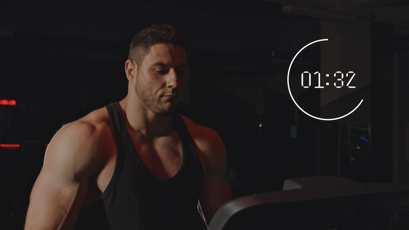
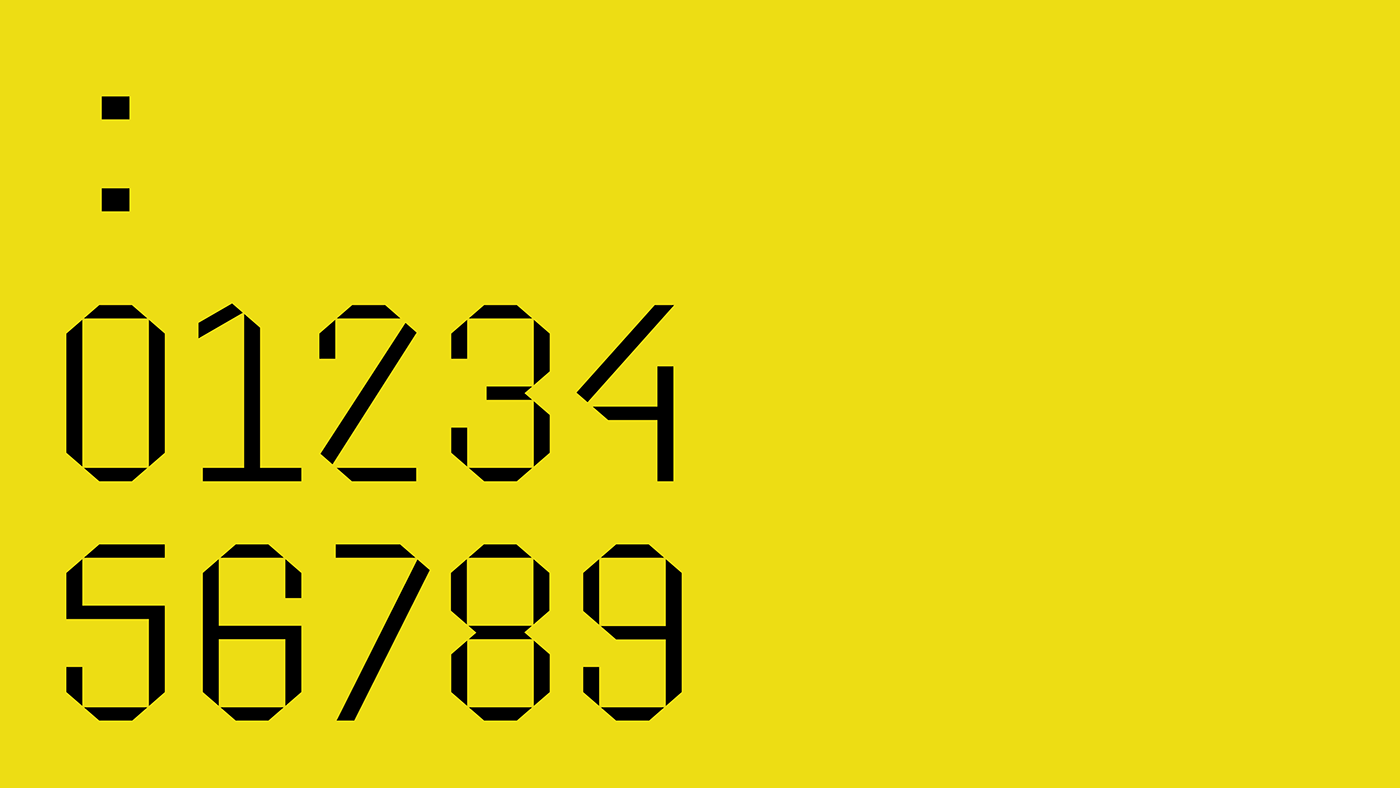
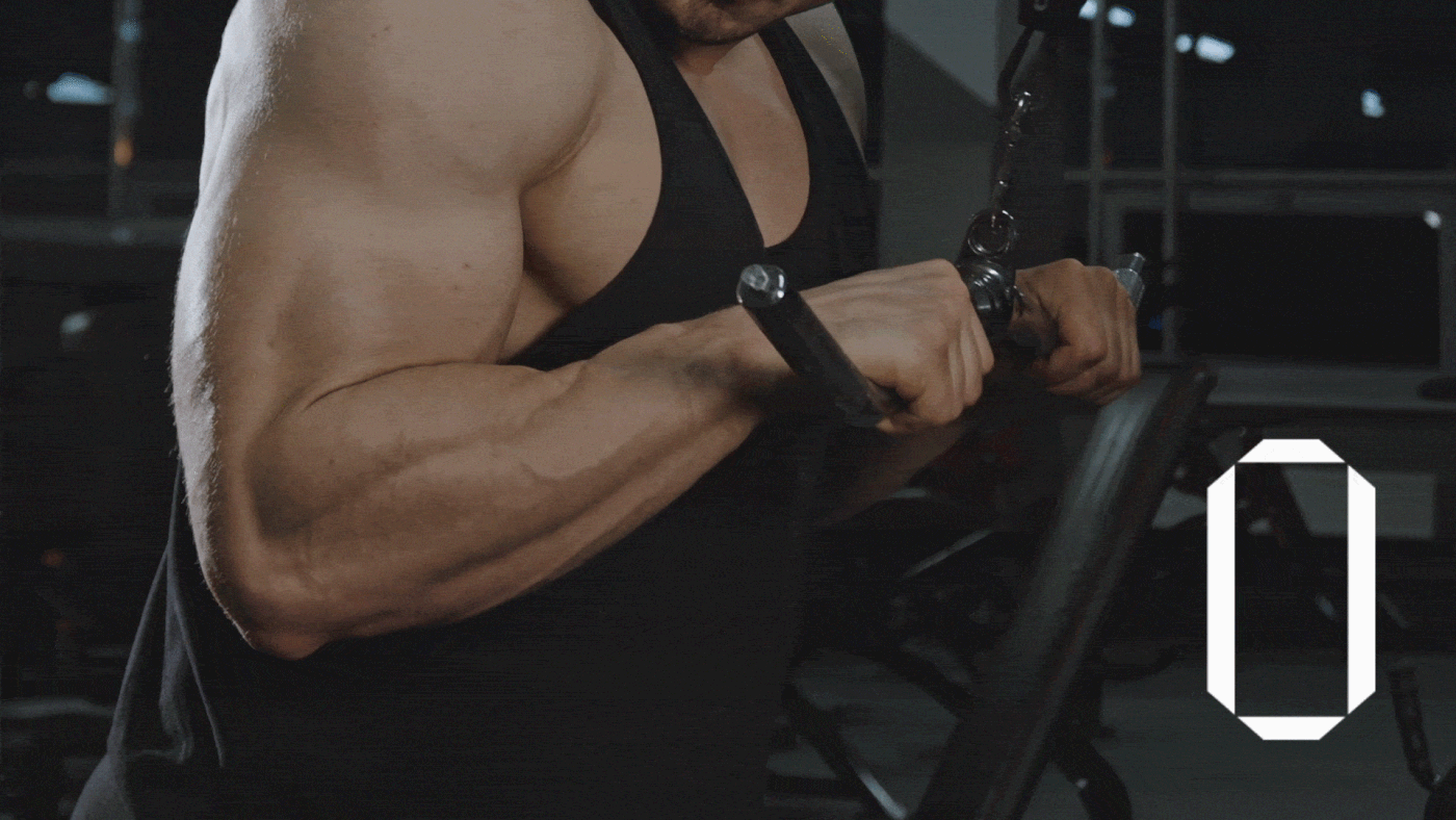
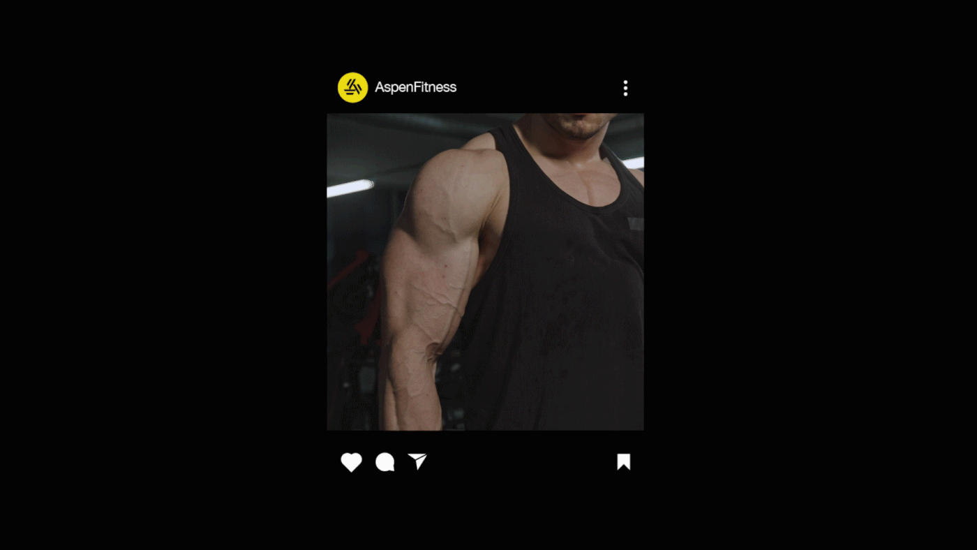
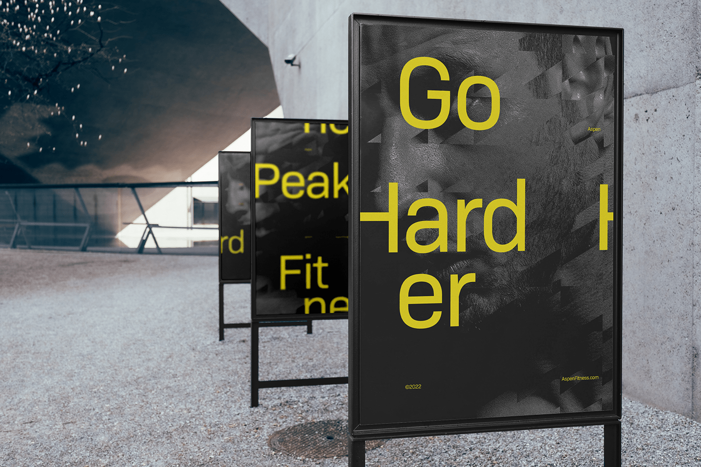
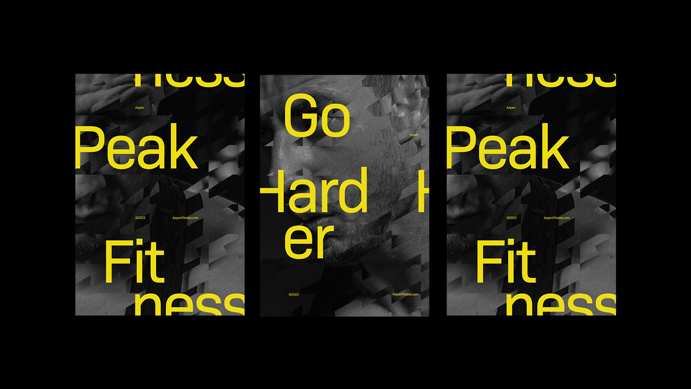
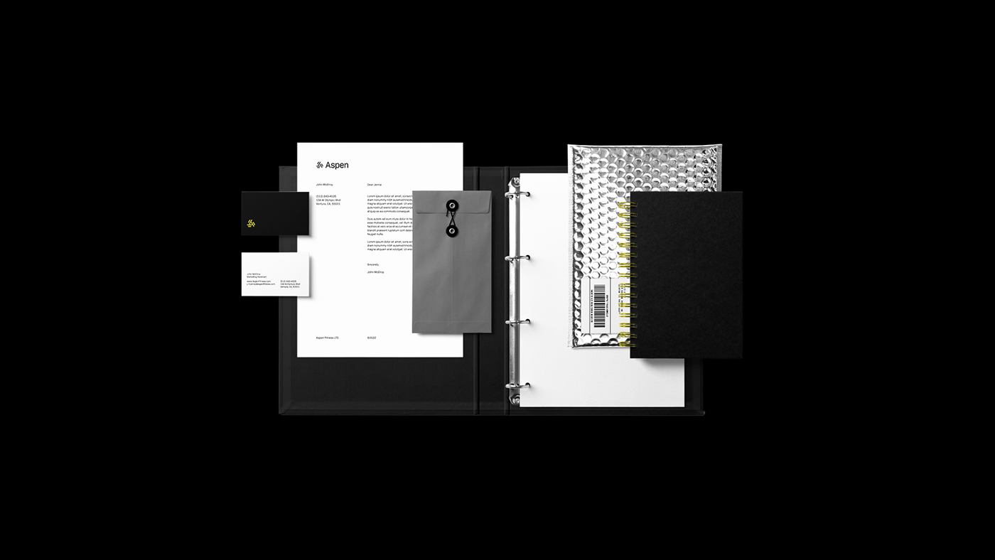
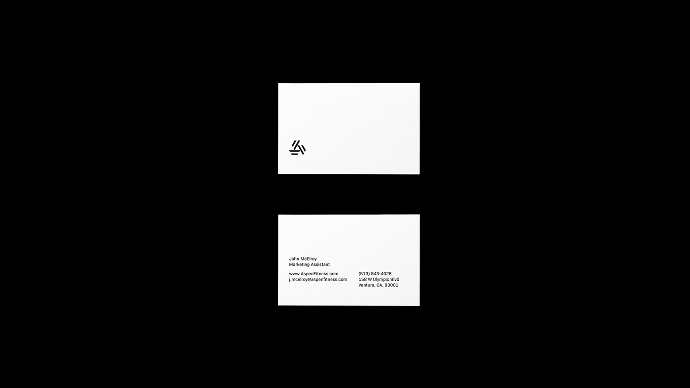
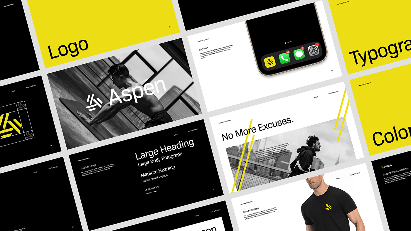
Aspen is for those who live to become greater. The goal for creating this identity was to visually match the focused intensity that Aspen provides to help do just that. Through the use of loud, contrasting colors, dynamic lines, motion graphics, and motivating messaging, customer retention is increased which will let Aspen focus on the service and value that they provide to their customers.
Client: Aspen Fitness LTD.
Services: Messaging, Logo & Identity, Guidelines, Motion Design, Custom Typography
Direction & Design: Patrick Tuell